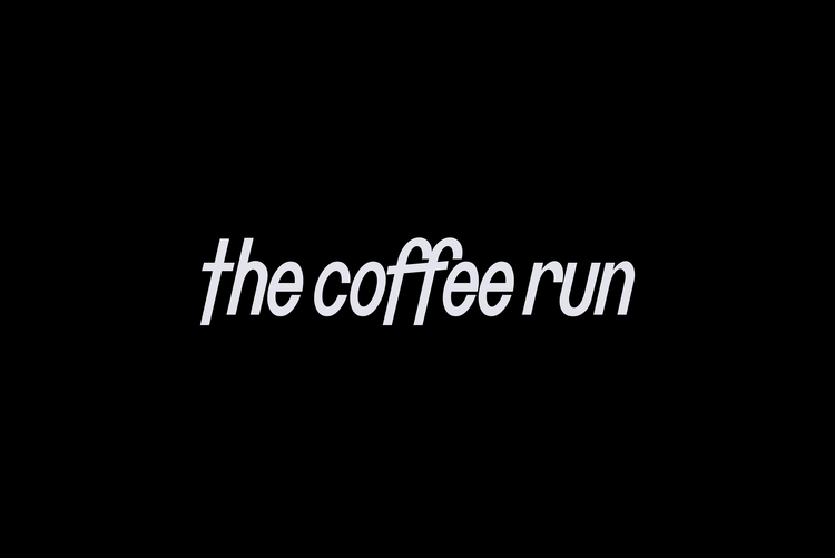
The Coffee Run


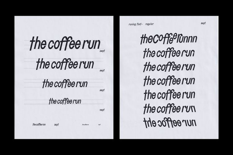
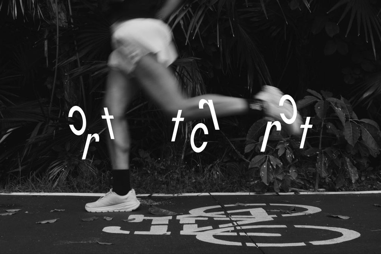
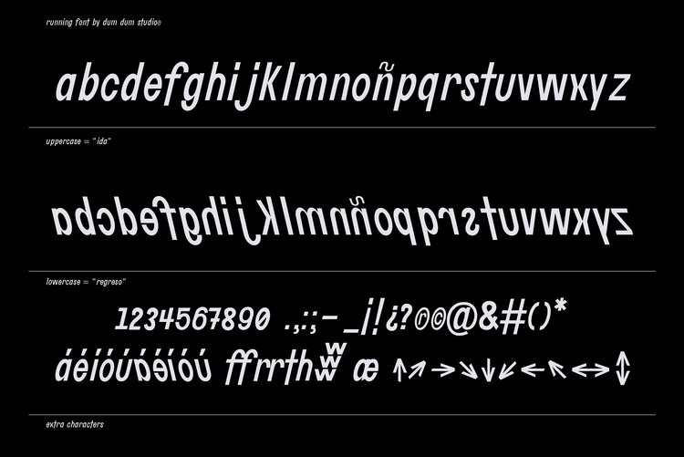
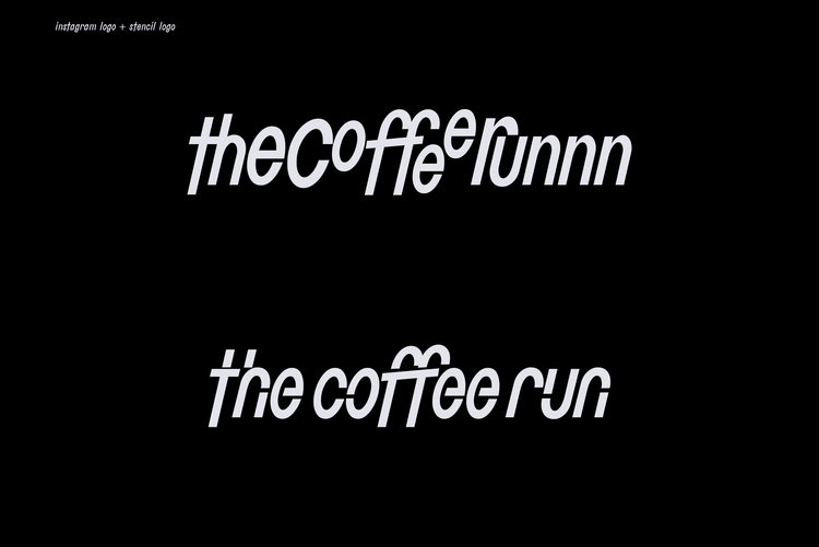
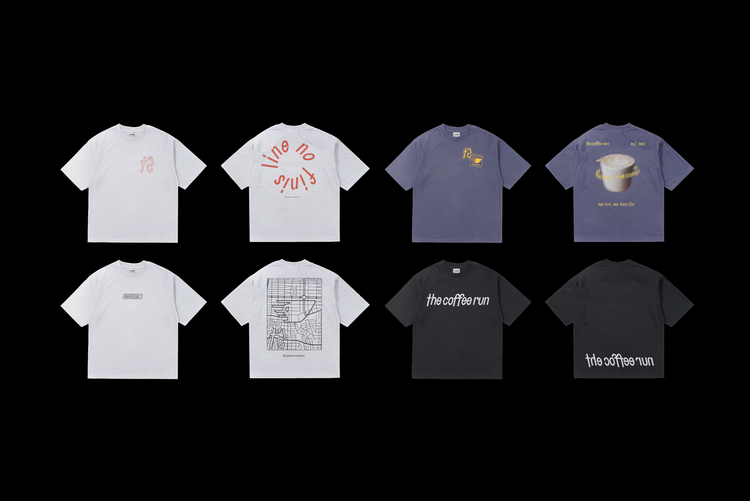
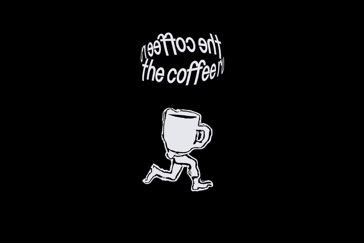
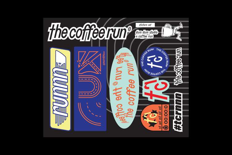
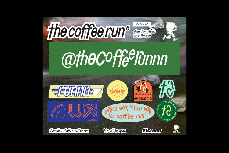
"The Coffee Run" is a vibrant community of runners and coffee lovers, and we had the pleasure of developing their identity through a bespoke typography. This typography is characterized by its dynamism, creating an illusion of movement. It is designed exclusively using lowercase letters to maintain diversity between the characters and to convey messages with a sense of lightness. Additionally, the unique feature of this typography is that when written in uppercase letters, it maintains its legibility and directionality, appearing right-side up. However, when written in lowercase letters, the typography is completely flipped and reversed, creating the impression of the typography running backward. While this reversal may reduce legibility slightly, it adds a playful touch, emphasizing the idea of running for fun.
d
Clients
Ielo
RAG
Botanical Aircare
Algo Studio
MAWNA
Georgina Treviño
BAR ESCALIER
GAFFER CNTRL
PEDRA Y GARTO
Sr.Bigotes
Punto Acido
POR SIEMPRE AMBAR
STITCH
AGUA JEWELRY
Hanabar
Carlos Balderrama at ARDE ARTE
Cañón de San Lorenzo
Nick Morgan Music
SERIAL STONE
México Lindo y *****
Michelle Sitton
CONGLOM-O
Vanesa Juez
The Coffee Run
Los Patrones
Arde Arte
Sackville Studios
OFFICE OF: OFFICE
Valeria Anastasia
Ash Pizza
Tikun Olam
OMMA 444
Motor Studio
Future Saint
Esant
RETTROFUTTURA
Celia et Louise
Foraneo